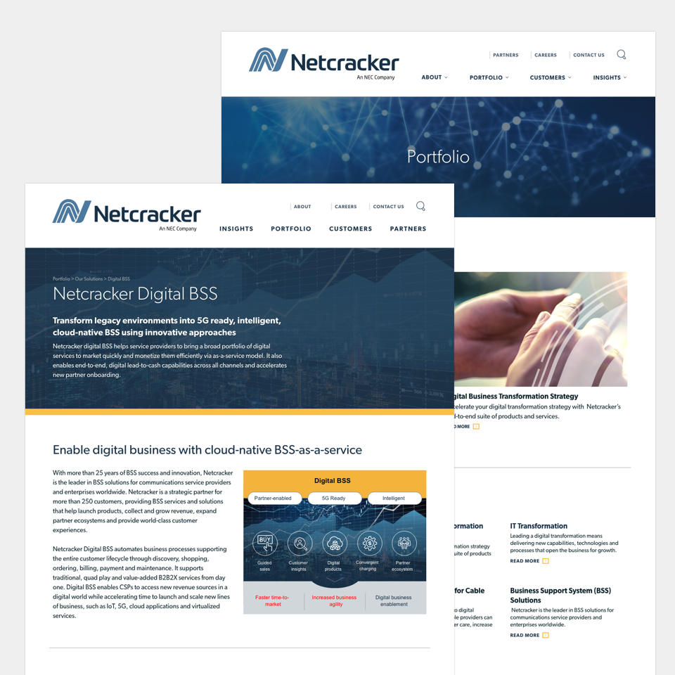
The project: Netcracker needed updates to their website to show new product offerings to their customers. The goal was to create components and layouts that could be used over 30+ pages on the site. While designing these pages, we needed to keep in mind consistency and brand throughout. This allowed us to deliver dedicated content areas within each page to both properly explain the product, as well as provide users supporting details for each product.
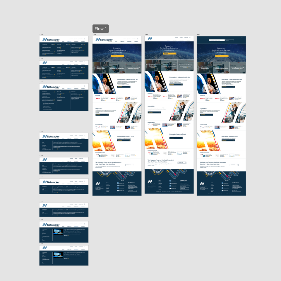
I worked closely with strategy and development to design and implement both these new responsive pages, as well as an updated menu navigation for the website.
With the page structure changing, this was also an opportunity to update the typography and spacing of the navigation drop downs, giving it a less-crowded look and feel. It also gave me the chance to create more of a mega-menu feel, including dynamic content for the blog, and callouts for relevant content under each tab. Adding functionality such as a sticky nav as you scrolled, as well as a new search interaction helped give the overall site a more updated feel for the launching of the new products.