When redesigning the Netcracker Insights blog, the goal was to create an updated layout with better readability across the board. Through visual hierarchy, typography and more interaction on the page, we aimed for improved time on page and engagement on the individual posts as well as the section overall.
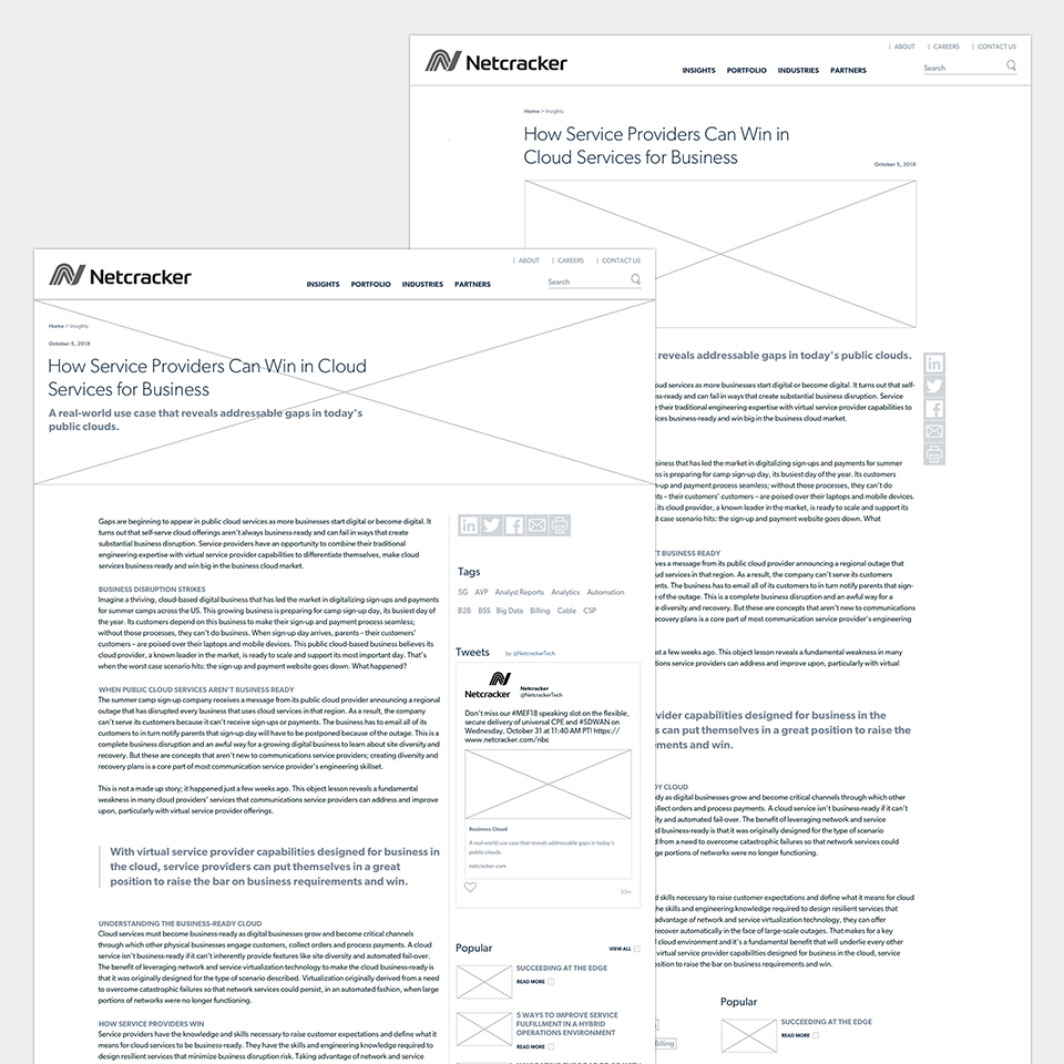
While developing wireframes, I took advantage of usertesting.com to test the original layouts of the Insights section. This helped me confirm basic usability needs for the layout such as more pathways further into the website, as well as clearer access to sharing the post.
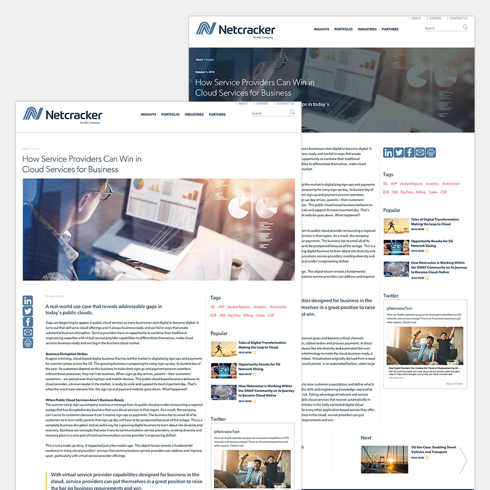
I was able to focus direction on a few different layouts with internal stakeholders, and moved into high-fidelity mockups utilizing Netcracker’s already existing styleguides. I did however decide to make some slight tweaks to improve readability of the page. I started with upping the size of the body copy, as the original 14px looked small in the brand’s font of Gibson. Making the font larger, allowed me to move the fonts to an 8:9 scale and improve layout hierarchy within the Insights section.
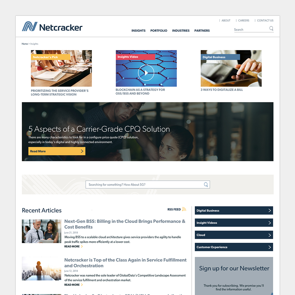
With research into competitors and other blogs, I worked closely with developers to improve the blog’s homepage as well. This redesign included a larger hero area with a featured post. A way to dynamically add other important posts that we wanted to gain traction at the top of the page. As well as the inclusion of dates and a more specific chronological order to posts on the homepage.